A family resemblance without the matching outfits.
Creative Services
Three distinct wines. One unmistakable family.
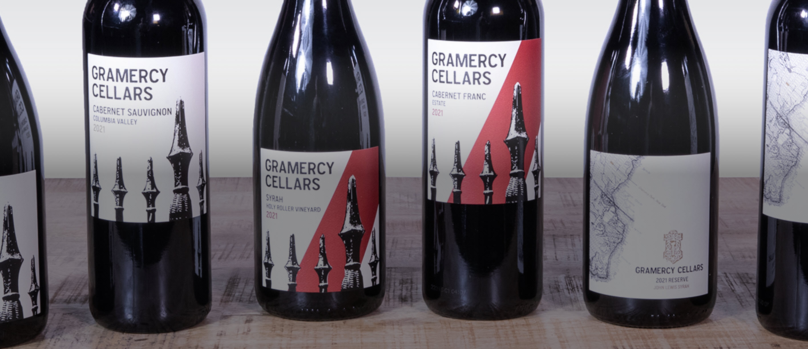
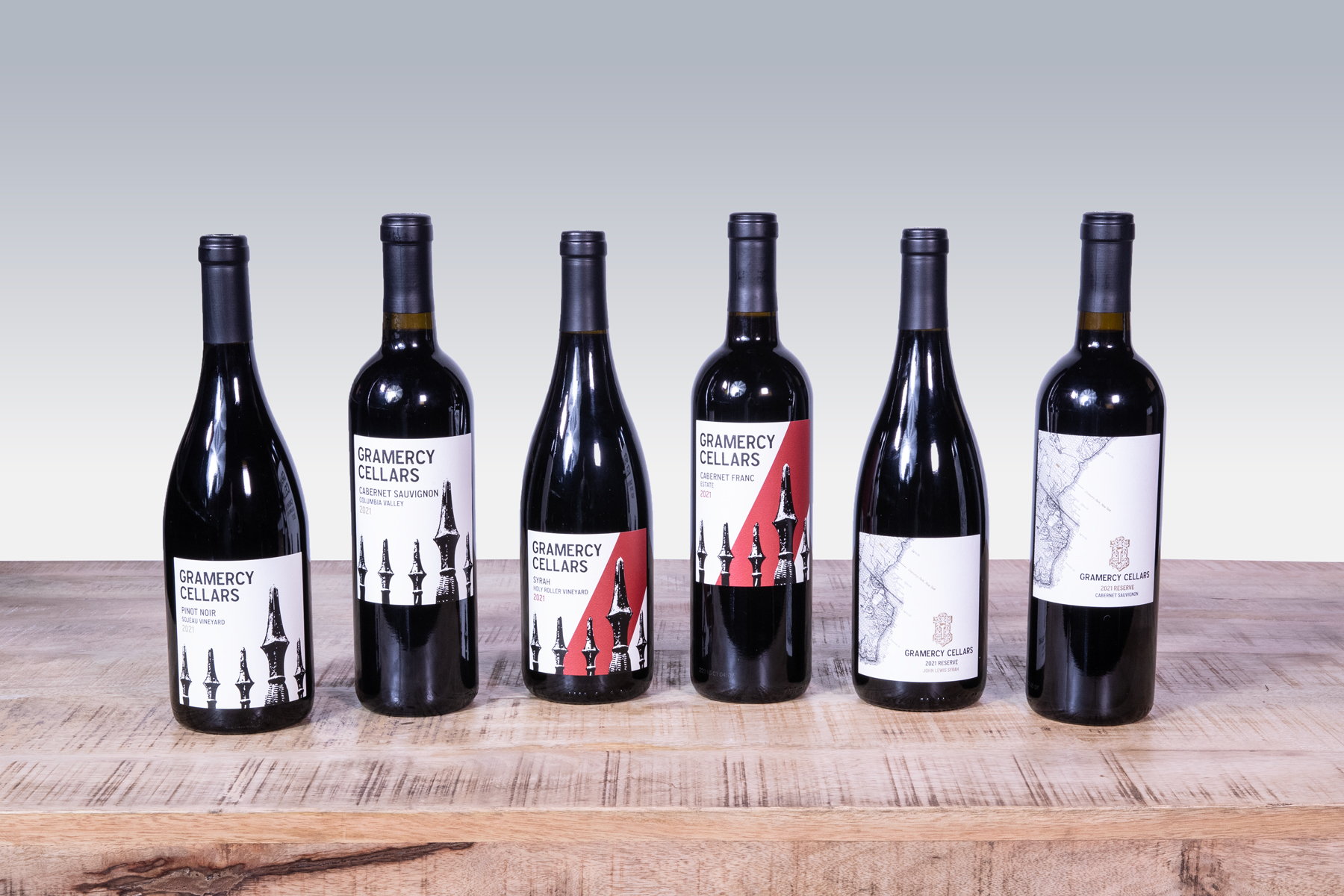
As Gramercy Cellars expanded its wine portfolio, GreenRubino created a unified label system for its Signature, Reserve, and MTA wines without sacrificing the individual character of each tier. The redesign brought greater clarity and consistency to the brand across packaging while preserving the understated identity longtime customers recognized and creating a more cohesive presence for a new generation of wine drinkers.
The Challenge
As Gramercy Cellars grew, its wines had grown apart.
The Signature, Reserve, and MTA labels had each evolved thoughtfully, but independently. What worked bottle by bottle was becoming less cohesive as a portfolio.
Gramercy needed a unified presence without losing what made each wine distinctly its own.
The Strategy
Consistency didn't have to mean conformity.
Instead of making the three tiers look alike, we created a shared visual language that let each one keep its personality while making it clear they all came from the same place.
The Solution
We refined each tier differently.
Signature became quieter and cleaner, with simple typography, white space, and a subtle debossed fence. Reserve retained its familiar Manhattan map, adding an embossed keyhole, Gramercy Park marker, and restrained matte-gold accents. MTA leaned into its bold personality with a vertical red bar and debossed pattern.
“We owe so much to your brilliance, perseverance, and creativity. From our website and collateral material designs to our stunning new labels, your talent shines through it all.”
Nichole Bigley
Director of Operations, Gramercy Cellars
Meaningful growth starts with understanding what is holding an audience back.
GreenRubino combines audience insight, strategic thinking, and creative problem solving to help brands navigate change and turn it into business advantage.