THE CHALLENGE: As Gramercy Cellars grew, their labels began telling slightly different stories. The Signature, Reserve, and MTA lines had each evolved on their own – thoughtfully, but independently – resulting in a portfolio that felt less like a family and more like distant cousins. The task was to modernize and unify the system without losing the minimalist restraint and understated confidence that make Gramercy, well, Gramercy. The goal: bring clarity, cohesion, and a touch more refinement to labels already beloved by longtime fans and a new generation of wine drinkers.
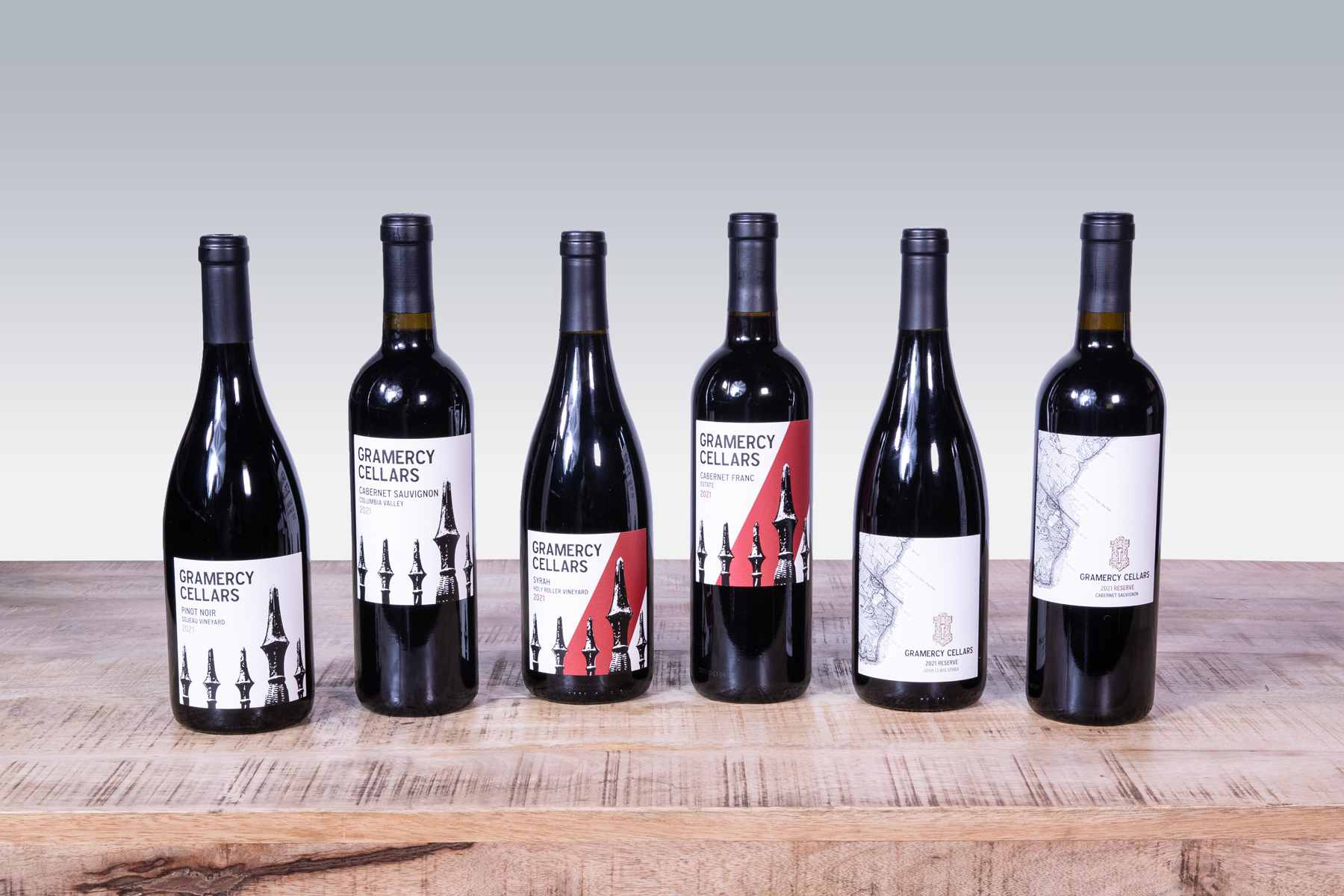
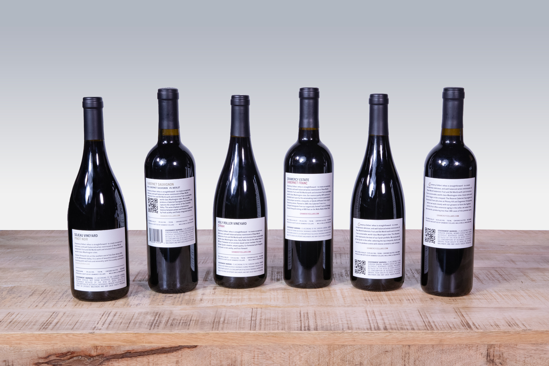
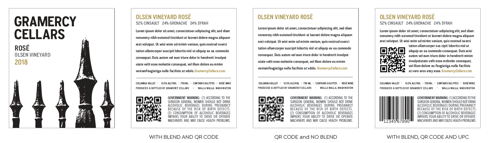
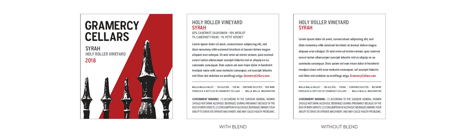
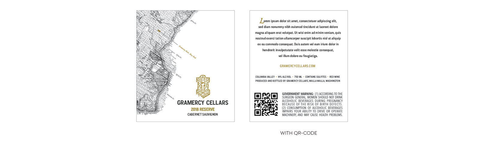
THE WORK: We developed a unified label system that elevated all three tiers while preserving what made each one distinct. Signature received a quiet refinement through simpler typography, more white space, and a subtle debossed fence. Reserve kept its recognizable Manhattan map, now sharpened with an embossed keyhole, a Gramercy Park marker, and restrained matte-gold accents. MTA embraced its bolder personality with a vertical red bar and debossed fence pattern. Back labels across the portfolio were clarified and standardized with space for blend details, QR codes, and UPCs. Every finish, from foil to embossing, was specified and executed with the print vendor to ensure premium, consistent production.
THE RESULTS: The refreshed system gives Gramercy Cellars a cleaner, more unified presence on the shelf while letting each tier express its own identity. Signature, Reserve, and MTA now feel unmistakably related, distinct in tone, aligned in spirit, and elevated where it matters most. Though newly released, the redesign positions the full portfolio with a confidence and clarity that match the quality inside every bottle. In short: a thoughtful evolution for a winery that never chases trends, but always knows exactly where it’s going.